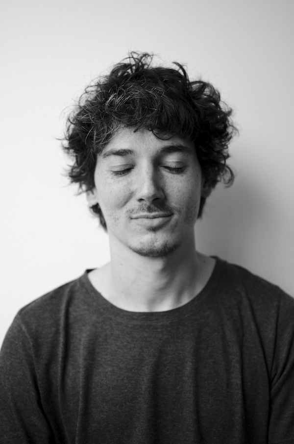
Photo of Manuel Larralde by Julieta Barrionuevo
To voyage this unique universe with Manuel Larralde
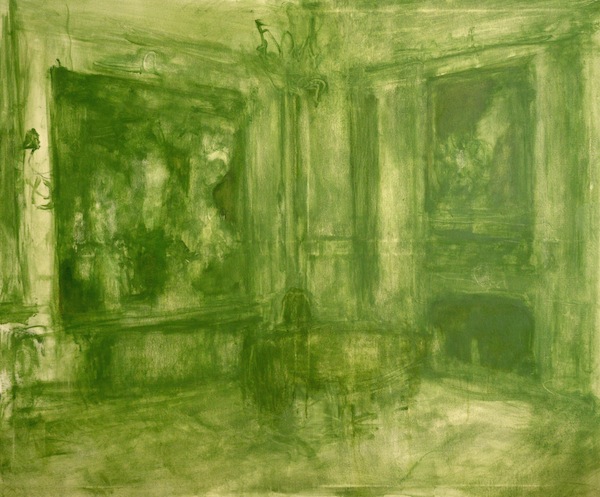
Born in Buenos Aires, Argentina, MANUEL LARRALDE moved to London to study Fine Art at the City & Guilds of London Art School. His experimentation with colours and ideas of the past has culminated in his latest collection: a series of stunning large-scale monochromatic paintings depicting interior retrospective scenes that one could literally step into.
In this interview he discusses memories, his intimate relationship with colour and more.
Interview by Will Kitson
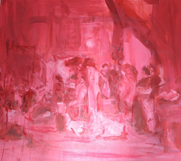
A Few Seconds Before | Manuel Larralde |120 x 100cm |Oil on canvas | 2015
Much of your work recollects childhood memories. Were you creative as a child? Do you remember your first creative impulse?
As a child I was mostly an observer, an avid reader with a vivid imagination. However, my creative impulse was more directed towards alchemy.
I was fascinated by mixing substances and colours in test tubes; I even had a chemistry set for children kept in a small hiding place at my parents’ house. The room was so tiny there was barely space for me to sit, but I would spend hours there, mixing substances and colours. My fascination with art began when I first saw The Garden of Earthly Delights by Hieronymus Bosch when I was 5 years old. I remember it having an effect on me somewhere between awe and terror. I also have a vague recollection of a children’s book that had images of frogs in the water and of circles of psychedelic colors. This image stuck in my unconscious and reappeared many years later while I was painting.
L’atelier du peintre | Manuel Larralde| 100 x 110cm | oil on canvas |2015
You’ve said that your works often come from present experiences that prompt involuntary recollections of the past. Could you give us an example of this, perhaps a particular recollection which has triggered one of your works?
While doing my MA at City and Guilds, London, I was searching for new ideas. One day at the Wallace Collection, I saw a clock on a fireplace with a mirror behind it. I suddenly glimpsed at the parallel world that opened up as a reflection of the mirror and was immediately taken back to my grandparents’ house, which featured a similar fireplace. I did a sketch first on watercolor and then with oil paint. I started looking for those lost images and thus my monochromatic series was born.

Pre-existing image |Manuel Larralde| 120 x 110cm | Oil on canvas
In what way does your work affect how you see the past?
The past is part of our personal history. We might forget it or even block it out, but its source is always there, underlying. It is like opening a book where certain stories come to life, estranged places and people that somehow no longer belong to us.
I like Proust’s concept of time where a forgotten memory can suddenly be brought back to us by a present stimulus. I am referring of course to Proust’s famous idea where the narrator’s childhood unravels involuntarily from the very specific taste of the madeleine cake. In my work it is essential because it starts a game where you can manipulate the different times and allows me to create an image that becomes timeless.
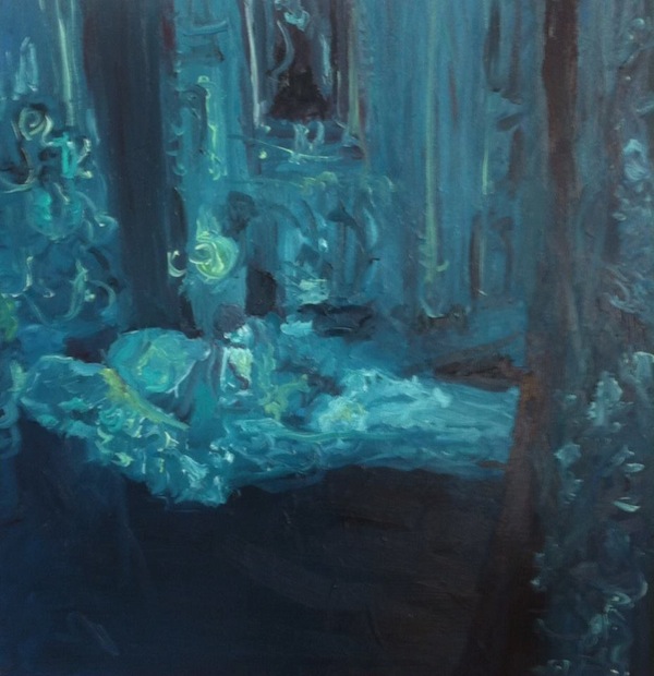
The Blue Room | Manuel Larralde| Oil on canvas |1m x 1m |2014
Your work represents interior scenes using a monochromatic palette. How do you go about matching images / memories with each colour? Do you follow a process or is it an instinctive decision?
The decision to use a certain colour is determined by the effect that this image has produced in me and that I want to convey. The colour creates a climate which can be mysterious, ghostly, translucent, or fluorine, just to name a few. The colour also works to create a contradiction. For example, in reproducing a masterpiece, or any baroque setting, I use an industrial or digital colour that, by contrast, generates a more ambiguous image than its original.
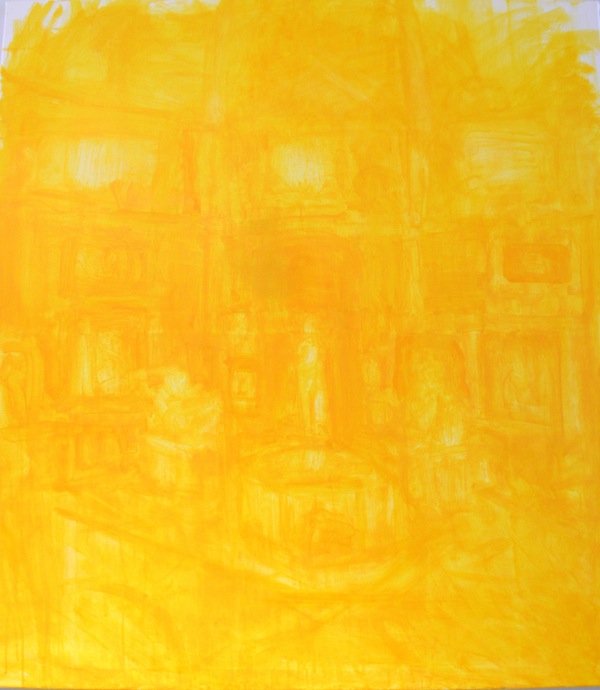
Yellow Renaissance | Manuel Larralde| Oil on Canvas |110 x 90cm
You’ve said that your work is concerned with producing a loss of consciousness in your audience, ‘a lapse, a descent, intoxication.’ How do you go about achieving this effect? Do you yourself have to be in an altered state of consciousness during your creative process?
After reading Aldous Huxley’s The Doors of Perception I was taken by the idea of a place that escapes the boundaries of time and space, where everything seems to coexist in the same plane. The use of a predominant colour helps me to create this universe, where the colour acts as a substance that takes over the picture.
My aim is to induce the spectator to voyage this unique universe. I want the viewer to feel that he is in a state of intoxication, as if he is the proxy of an external agent that commands him and does not let go of him. As per your last question, whether I need to be in a special state of mind during my creative process, I must say that any alteration occurs at an unconscious level. When I paint I am very focused and my attention is directed to navigate that new universe that opens up like a terra incognita.
Describe a place where you feel the most creative.
It has little to do with a place in particular. The most important thing is to work; once you start to paint or draw new images and ideas appear. However, the space where I’m calmest is my house. Sometimes when I have a creative blank and cannot think of anything, it helps me a great deal to read, especially philosophers on the topic of art. For me, language is a great catalyst for images.
A colour which describes your mood today …
Different yellows. I am inspired by the different hues of yellow that can be found in indiscriminate objects, fabrics or materials such as clothes, fruits, flowers, leaves, porcelain etc. A yellow lemon might appear to me aggressive and bitter, while a Naples yellow gives me the impression of something absolutely warm and full of history.
Share with:
Published: October 1st, 2015